
Histogram vs Bar Graph: When to use histogram vs bar graph
Learn when to use a histogram vs bar graph, how they differ, and common mistakes to avoid when choosing the right data visualization chart.


Bar Graph vs Histogram helps you understand how to visualize data more effectively and choose the right chart for your analysis.
You can use these two visualization types to compare values or understand how data is distributed, depending on your dataset. While they may look similar at first glance, they serve different purposes and provide different types of insights. Bar graphs are used to compare separate categories, whereas histograms are designed to show how continuous data is spread across ranges.
Choosing the wrong chart can lead to unclear insights or incorrect interpretation. This article shows you how to understand the difference between bar graphs and histograms, when to use each, and how to avoid common mistakes in data visualization.
Bar Graph vs Histogram (Quick Answer)
Bar Graph → Used to compare categorical data
Histogram → Used to show distribution of continuous data
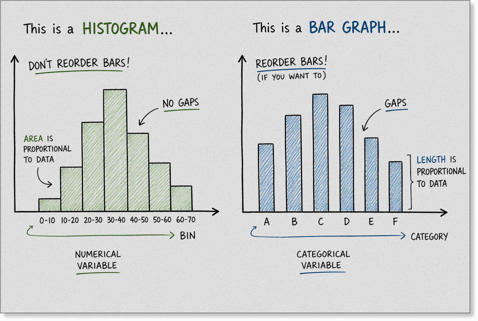
Bar graph bars are separated
Histogram bars touch each other
Bar graphs show comparison
Histograms show patterns and distribution
Bar graph order can change
Histogram order is fixed
Here’s a Quick Glance at What a Bar Diagram and What is Histogram Are
A bar graph (bar chart or bar diagram) is an important part of data visualization that presents categorical data in a simple and clear way. Each bar represents a separate category, and its height or length shows the value. The bars are spaced apart, making it easy to compare different groups like sales by region, product performance, or survey results. Because of its clarity and simplicity, a bar graph is widely used in reports, dashboards, and presentations where quick comparison matters.
A histogram, on the other hand, is a visual representation of the distribution of quantitative data. It shows how numerical values are spread by grouping them into ranges (bins) and displaying how often each value occurs within those ranges. The bars in a histogram touch each other, indicating continuous data. This makes it useful for understanding frequency distribution, patterns, and how data is concentrated across different value ranges.
Bar Graph vs Histogram: Key Differences
Feature | Bar Graph | Histogram |
|---|---|---|
Purpose | Used to compare values across different categories | Used to understand how data is distributed across a range |
Data Type | Works with categorical (discrete) data | Works with continuous (quantitative) data |
X-Axis | Shows distinct categories or labels | Shows numeric intervals (bins or ranges) |
Y-Axis | Represents exact values or counts for each category | Represents frequency (how often values fall within each range) |
Variables | Typically involves one categorical variable | Involves one continuous variable grouped into ranges |
Bars | Bars are separated to indicate independent categories | Bars touch each other to show continuous flow of data |
Scalability | Works best with a limited number of categories for clear comparison | Scales well with large datasets by grouping values into bins |
Which Is Better for Data Visualization: A Bar Graph or a Histogram?
Both charts help you understand data, but they serve different purposes depending on what you’re trying to analyze. A bar graph is ideal for comparing categories, while a histogram is designed to show the distribution of continuous data.
The choice isn’t about which one is better overall, it’s about which one fits your data and the story you want to tell. Using the right chart can make your insights clearer, while the wrong one can lead to confusion or misinterpretation.
In this guide, we’ll break down how each chart works, their key differences, and when to use each for accurate and effective data visualization.
Bar Graph Overview
Bar graphs focus on comparing individual categories side by side. Each bar represents a separate group, making it easy to spot differences in values, rankings, or performance.
They are especially useful in business reports, surveys, and dashboards where clear comparisons matter.
Histogram Overview
Histograms are used to analyze the distribution of continuous data. They group values into intervals (bins) to show how frequently data points fall within each range.
This helps you identify patterns like skewness, spread, and common value ranges in your dataset.
Key Difference
The core difference lies in purpose and data type.
Bar graphs use categorical data with separated bars, while histograms use continuous data with connected bars to show distribution. Misusing them can lead to misleading or unclear insights.
Which One Should You Use?
Use a bar graph when comparing categories or discrete values. Choose a histogram when exploring trends, patterns, and the overall shape of your data.
Selecting the right chart ensures your data is both accurate and easy to interpret.
If you’re new to data concepts, read this simple guide on KPIs and BI basics
Which Is Better for Comparing Data?
To answer this, you need to look at the type of data you’re working with and what kind of insight you want to extract.
Bar Graph for Data Comparison
Bar graphs are specifically designed for comparing discrete categories. Each bar represents a distinct group, making it easy to evaluate differences in values across segments like products, regions, or time periods.
If your goal is side-by-side comparison, bar graphs provide clear and direct insights.
Histogram for Data Distribution
Histograms are not meant for comparing categories. They are used to show how data is distributed by grouping continuous values into ranges (bins).
This makes them useful for identifying patterns like frequency, spread, and data concentration rather than direct comparisons.
Key Difference
The main difference lies in intent. Bar graphs compare separate categories, while histograms reveal the shape and distribution of continuous data.
Using a histogram for comparison can lead to confusion, just as using a bar graph for distribution can hide important patterns.
Which One Should You Use?
If you need to compare values across categories, a bar graph is the better choice. If you want to understand how your data is distributed, a histogram is more effective.
For video explanation, watch how bar graphs differ from histograms in this step-by-step data visualization tutorial.
Which Visualization Highlights Data Distribution More Clearly?
Both bar graphs and histograms are widely used to present data visually, especially when you want to move beyond raw numbers and understand underlying patterns.
They help you evaluate things like:
Value distribution
Frequency of observations
Data concentration
Spread across ranges
Outliers and gaps
But the way each chart represents this information is fundamentally different.
Bar Graph Visualization
Bar graphs are designed to compare distinct categories. Each bar represents a separate label, which makes it effective for showing differences in values across groups like products, regions, or time periods.
However, since each category is treated independently, bar graphs don’t capture how values relate across a continuous scale. This limits your ability to see patterns like clustering, skewness, or how evenly the data is spread.
Histogram Visualization
Histograms are specifically built to highlight data distribution. They group continuous values into intervals (bins) and display how many data points fall within each range.
This makes it easier to identify where most values lie, how wide the spread is, and whether the data follows a normal pattern or shows irregularities. You can also detect peaks, tails, and gaps that would otherwise remain hidden.
Distribution Clarity Winner
Histograms offer a clearer and more meaningful view of data distribution. They reveal structure and variation in a way that bar graphs cannot, making them the better choice when your goal is to understand how data is spread rather than just compare categories.
Explore how the best business intelligence tools can help you build dashboards, track metrics, and visualize data effectively.
Which Visualization Offers the Best Value Overall?
Now it’s time for the question that’s probably on your mind: which visualization actually delivers the most value in real-world use?
The answer depends on how you work with data and what kind of insight you need on a regular basis.
Bar Graph Value
Bar graphs are highly practical for everyday use. They make it easy to compare categories, present results in reports, and communicate insights to non-technical audiences.
Their simplicity and clarity make them a go-to choice for dashboards, business analysis, and quick decision-making.
Histogram Value
Histograms bring more depth when you need to analyze how data behaves. They help you understand distribution, variation, and patterns within continuous data.
This makes them especially useful for performance analysis, forecasting, and identifying trends that aren’t obvious at first glance.
Best Value Overall
If your focus is clear communication and quick comparisons, bar graphs offer more immediate value. But if your goal is deeper analysis and understanding data patterns, histograms provide more meaningful insights.
In most cases, the best approach isn’t choosing one over the other, it’s using the right visualization based on the problem you’re trying to solve.
Common Mistakes to Avoid
1. Using a Histogram for Category Data (e.g., Countries, Products)
If your dataset includes labels like “USA,” “Mobile,” or “Electronics,” a histogram is the wrong choice. It will force categories into numeric ranges, which removes meaning and makes the visualization misleading. Use a bar graph instead for clear comparison.
2. Using a Bar Graph to Analyze Distribution
Bar graphs don’t show how values are spread across a range. For example, if you’re analyzing exam scores or user session time, a bar graph won’t reveal patterns like clustering or skewness. This can lead to missed insights that a histogram would clearly show.
3. Poor Bin Selection in Histograms
Choosing the wrong bin size can distort your data. Using too few bins (like 5) oversimplifies and hides patterns, while too many bins (like 20) creates noise. Proper binning balances clarity and detail, helping reveal true distribution without misleading peaks or masking important insights.
4. Misrepresenting Data by Ignoring Bar Structure
Bar graphs require spacing because categories are independent, while histograms require touching bars to reflect continuous data. If you mix this up, your chart may look visually correct but communicate the wrong type of data relationship.
Real-World Example for Better Understanding
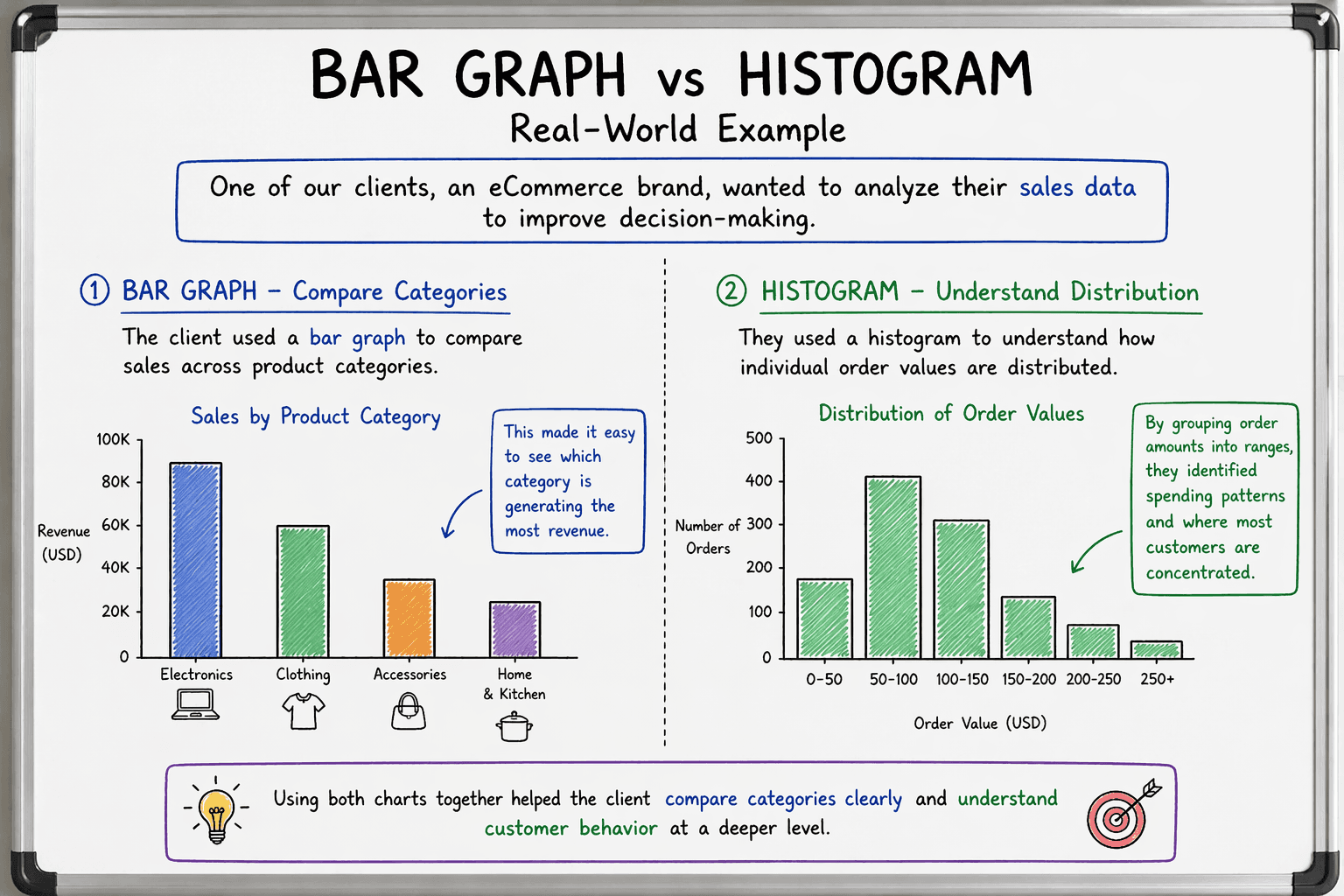
One of our clients, an eCommerce brand, wanted to analyze their sales data to improve decision-making.
They used a bar graph to compare revenue across product categories and found that electronics contributed 45% of total revenue ($450K out of $1M), followed by clothing at 30% and accessories at 15%. This made it easy to identify top-performing categories.
At the same time, they used a histogram to analyze order value distribution. They discovered that 60% of orders were under $50, with an average order value of $42 and only 10% of orders above $150.
Using both charts together helped them clearly compare category performance while also understanding customer spending behavior at a deeper level.
Ready to Create Stunning Bar Graphs & Histograms? Try Supboard Now
Mastering bar graphs vs. histograms is just the beginning. With Supboard’s intuitive dashboard platform, you can instantly create both chart types plus pie charts, line graphs, scatter plots, and heatmaps, all from your datasets. No coding required.
Supboard offers:
• Drag-and-drop visualization builder
• Multiple chart overlays for rich insights
• Real-time collaboration and sharing
• Export to PDF/PNG for reports
Perfect for analysts, marketers, and students. Start your free trial today and transform raw data into compelling visuals that drive decisions. Sign up at supaboard.ai and elevate your data storytelling.
Final Thoughts
I’ve worked with both bar graphs and histograms across different types of data analysis, and each one has proven useful in its own way. They don’t compete as much as they complement each other when used in the right context.
So to come to a conclusion, I considered multiple factors, including:
Clarity of insights
Ease of understanding
Type of data
Use case flexibility
Depth of analysis
Communication effectiveness
But if I had to choose ONE visualization for most everyday scenarios, I’d go with bar graphs. They are simple, clear, and work well for quick comparisons and decision-making.
That said, this isn’t an easy choice. If your focus is understanding patterns and data distribution, histograms are incredibly valuable.
In reality, you can’t go wrong with either, what matters most is using the right chart based on what you want to learn from your data.
Want to see how modern tools simplify charts and dashboards? Explore AI-powered BI platforms here.