
BI Dashboard: What It Is, Why It Matters & How It Helps.
Discover what a BI dashboard is, why it matters for business growth, and how it helps teams analyze data and make faster, smarter decisions.


What Is a Business Intelligence Dashboard?
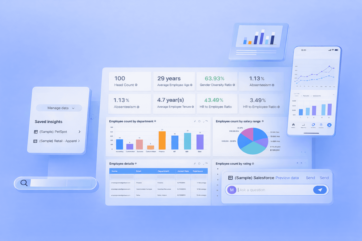
A business intelligence dashboard is a data visualization tool that brings together important business data such as sales, marketing, finance, and operations into one clear and easy-to-read screen. It shows key performance indicators (KPIs), trends, and comparisons using charts, tables, and graphs, helping users understand performance at a glance.
Instead of switching between multiple tools or spreadsheets, teams can access everything in one place. Modern BI dashboards are interactive, allowing users to filter data, explore details, and customize views. This makes business intelligence analytics faster, more accurate, and more useful for daily decision-making.
For example, a marketing team can track ad spend, conversions, and revenue side by side to improve campaign performance. In simple terms, a business intelligence dashboard turns raw data into meaningful insights that support smarter and faster business decisions.
How Business Intelligence Dashboards Are Used in Real Life
For Founders: Tracking Growth and Revenue
Founders use BI dashboards to monitor revenue growth, customer acquisition, retention, and profitability. With all key business metrics in one place, they can evaluate company health and make data-driven decisions related to hiring, expansion, and investments.
For Managers: Monitoring Team Performance
Managers rely on business intelligence dashboards to track productivity, targets, and operational efficiency. These dashboards help identify delays, performance gaps, and workflow issues early, enabling better team management and improved business outcomes.
For Teams: Supporting Daily Decision-Making
Teams use dashboards to prioritize tasks, manage workloads, and respond to changes. Whether it is sales teams tracking leads or support teams monitoring tickets, dashboards provide instant visibility that improves focus and reduces confusion.
For Analysts: Validating Data and Generating Insights
Data analysts use BI dashboards to validate data accuracy, analyze trends, and identify anomalies. By combining multiple data sources, dashboards help analysts present insights clearly, increasing trust among stakeholders and decision-makers.
Simple Workflow: From Data to Decisions
In most organizations, data is collected from various tools and databases. It is then cleaned, processed, and visualized in a business intelligence dashboard. Teams review the insights, understand patterns, and take action. This workflow ensures data becomes valuable knowledge instead of unused information.
BI Dashboards vs BI Reports: When to Use Which and Why
A BI dashboard is designed for real-time monitoring and quick understanding. It displays live or frequently updated data and is suitable for daily use by non-technical users.
A BI report focuses on historical analysis and detailed evaluation. Reports often require technical expertise and are mainly used by analysts for deep research, forecasting, and performance reviews.
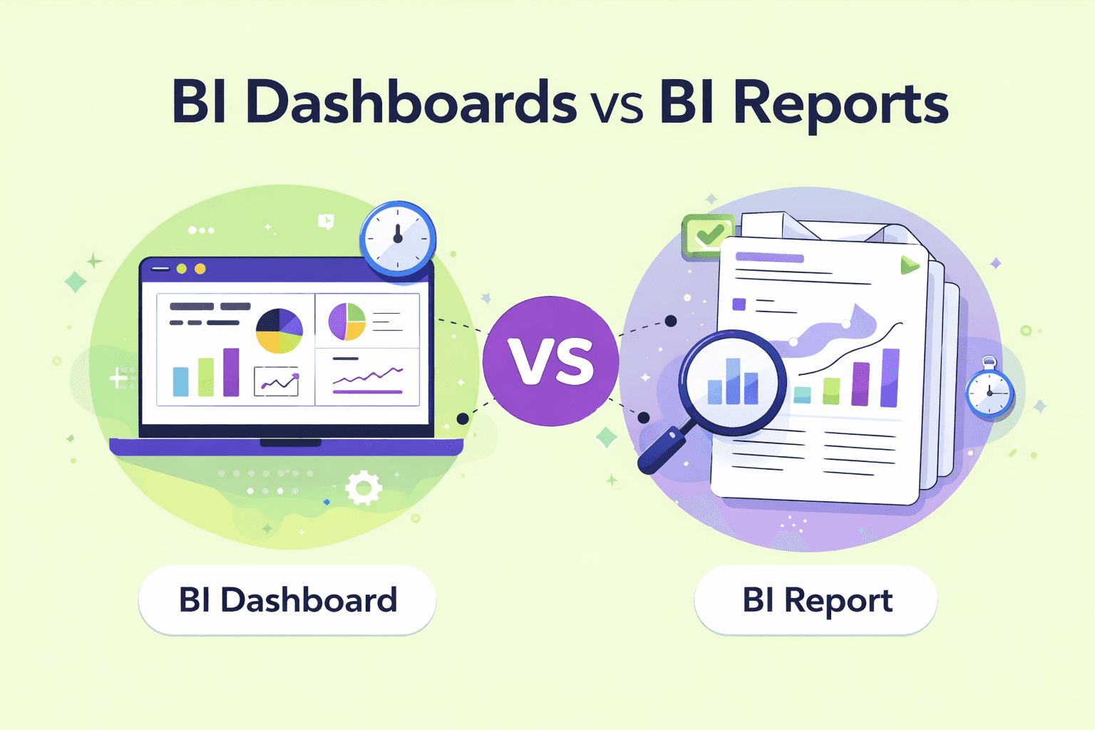
Key Differences
Feature | BI Dashboards | BI Reports |
|---|---|---|
Main Use | Used by managers, non-technical founders, business teams, and enterprise users for daily tracking, performance monitoring, and quick data-driven decision-making. | Used by analysts and leaders for detailed analysis, forecasting, and long-term planning. |
Screen Size | Designed to fit on a single screen for easy viewing. | Usually spread across multiple pages with detailed data. |
Level of Detail | Shows high-level KPIs and summaries for fast understanding. | Provides deep insights, explanations, and historical analysis. |
Data Updates | Displays real-time or frequently updated data. | Updated periodically (weekly, monthly, or quarterly). |
Filtering Options | Offers basic filters focused on summary views. | Supports advanced filtering and detailed data exploration. |
Alerts & Notifications | Sends automatic alerts when key metrics cross limits. | Does not provide alerts; requires manual review. |
Decision Speed | Supports fast operational and daily decisions. | Supports slower, strategic, and long-term decisions. |
User Experience | Visual, simple, and easy for non-technical users. | Data-heavy and mainly suited for technical users. |
Quote by Gartner
Organizations that effectively use analytics and business intelligence dashboards are significantly more likely to make faster, more accurate, and data-driven decisions than their competitors.
Main Features of a Good BI Dashboard: What Really Matters
KPIs and Business Metrics
Shows the most important numbers that reflect business performance, such as revenue, growth, or customer retention.Clear Visual Elements
Uses charts, tables, and trend lines to make data easy to read and understand at a glance.Filters and Drill-Down Options
Allows users to filter data and explore details to understand why numbers change.Accurate and Updated Data
Displays fresh and reliable data so decisions are based on correct information.Natural Language Queries (NLQ)
Lets users ask questions in simple language and get instant answers from the dashboard.Business Context (Targets and Benchmarks)
Shows goals, past performance, and industry standards to help users judge results properly.
Main Features of a Good BI Dashboard: What Really Matters
KPIs and Business Metrics
Displays essential metrics such as revenue, growth rate, customer retention, and conversion rates.
Clear Visual Elements
Uses simple charts, tables, and trend lines for easy interpretation.
Filters and Drill-Down Options
Allows users to explore data deeply and understand performance changes.
Accurate and Updated Data
Ensures decisions are based on reliable and fresh information.
Natural Language Queries
Lets users ask questions in simple language without writing SQL.
Business Context and Benchmarks
Shows goals, targets, and industry comparisons for better evaluation.
Types of BI Dashboards With Easy Examples
Operational Dashboards
Operational dashboards focus on daily business activities such as order processing, system uptime, and support tickets. They help teams respond quickly to issues and maintain smooth operations.
Use when: You need to monitor daily performance and respond immediately to problems.
Analytical Dashboards
Analytical dashboards are designed for deeper analysis and understanding patterns in data. They help users study customer behavior, identify reasons for churn, and explore trends over time. These dashboards are mainly used by analysts and managers who want detailed insights.
Use when: You want to analyze past data and understand why things are happening.
Strategic Dashboards
Strategic dashboards are designed for executives and leadership teams. They focus on high-level goals such as revenue growth, market share, and long-term planning.
Use when: You need a high-level view to guide long-term strategy and business direction.
What Makes a BI Dashboard Actually Useful for Decisions
A BI dashboard is most effective when it supports real decision-making, not just visual appeal. The following points explain what truly makes a dashboard valuable:
Focus on Decisions, Not Decoration
A good dashboard highlights important insights instead of unnecessary design elements.One Dashboard, One Main Goal
Each dashboard should serve a single clear purpose, such as tracking sales or customer retention.Remove Unnecessary Metrics
Avoid showing too many numbers. Only include metrics that directly support business goals.Show Trends, Not Just Numbers
Display patterns and changes over time to help users understand performance direction.Make Insights Easy to Act On
Insights should clearly indicate what needs attention so users can take quick action.
When these principles are followed, dashboards become practical tools that help teams make faster, smarter, and more confident decisions.
Quote by McKinsey & Company
“Companies that leverage data-driven insights through BI dashboards and advanced analytics consistently outperform peers in productivity, profitability, and customer satisfaction.”
Common Mistakes Teams Make With Dashboards
Too Many KPIs
Showing too many metrics makes it hard to focus on what really matters. Teams should select only the most important KPIs linked to their goals.No Clear Purpose
Dashboards without a specific objective often confuse users. Every dashboard should be built around one main business question.Outdated Data
When data is not updated regularly, users stop trusting the dashboard. Automatic data refresh helps maintain accuracy.Hard-to-Understand Charts
Complex or unfamiliar visuals can confuse users. Simple charts like bar graphs and line charts improve clarity.Built for Analysts, Not Users
Dashboards designed only for technical users limit adoption. Creating dashboards for non-technical users increases usage and value.
Avoiding these mistakes helps teams build dashboards that are easy to use, reliable, and truly helpful for decision-making.
Challenges of Business Intelligence Dashboards
1. Data Quality Issues
If source data is incomplete or incorrect, dashboards show misleading insights. Poor data quality reduces trust and leads to wrong decisions.
2. Too Many Metrics
Including too many KPIs makes dashboards confusing. Users struggle to focus on what truly matters for decision-making.
3. Low User Adoption
Dashboards built only for technical users are often ignored. If dashboards are hard to use, teams stop relying on them.
How AI Is Changing Business Intelligence Dashboards
Natural Language Queries
AI allows users to ask questions in simple language instead of writing SQL queries, making dashboards accessible to non-technical users.Automatic Insights
The system highlights important trends, patterns, and correlations, helping users discover useful information without manual analysis.Anomaly Detection
AI identifies unusual data behavior, such as sudden drops in sales or unexpected cost increases, so teams can act quickly.Faster Answers
By processing large datasets instantly, AI delivers quick insights and reduces delays in decision-making.Less Dependency on SQL
Users no longer need advanced technical skills to explore data, which increases adoption across teams.Smarter Context-Aware Analytics
Platforms like Supaboard use AI trained on business logic to provide accurate and relevant insights, improving trust and usability.
Business Intelligence Dashboard Examples
Business intelligence dashboard examples include sales dashboards for tracking revenue and targets, marketing dashboards for monitoring traffic and conversions, finance dashboards for expenses and profitability, and operations dashboards for daily activity tracking. These dashboards bring data from multiple sources into one clear view to support faster decision-making.
Real-World Example: How a US-Based Company Used a BI Dashboard
A US-based SaaS company faced challenges due to fragmented data across sales, marketing, and product systems. Decision-making depended on manual reports, which slowed visibility and limited alignment across teams.
After adopting a BI dashboard, the company:
Centralized data from multiple business systems
Gained a real-time view of pipeline, customer behavior, and product usage
Identified high-value customer segments more clearly
Improved coordination between sales, marketing, and leadership
Shifted from reactive reporting to proactive decision-making
The BI dashboard became a daily tool for leadership, helping teams rely on consistent insights rather than assumptions.
Turning Dashboards Into Real Business Insights With Supaboard
Supaboard helps teams move beyond basic reporting by transforming dashboards into intelligent decision-support systems. Instead of just showing numbers, it helps users understand trends, ask questions, and get meaningful answers from their business data.
Key Points
AI-Powered Insights
Supaboard analyzes data automatically and highlights important patterns and changes.Natural Language Queries
Users can ask questions in simple language without writing SQL.Business Context Awareness
Dashboards understand company goals, metrics, and rules.Faster Decision-Making
Teams get instant answers and act quickly on insights.Easy for All Users
Both technical and non-technical users can use dashboards confidently.
How to Start Using BI Dashboards in Your Team
Define Clear Goals
Start by identifying what decisions the dashboard should support, such as tracking revenue or improving customer retention.Choose the Right Metrics
Select only the metrics that directly relate to your goals and avoid unnecessary data.Connect Your Data Sources
Bring data from tools like sales, marketing, finance, or operations into one place.Build Your First Dashboard
Create a simple dashboard focused on one purpose instead of trying to cover everything at once.Review It Weekly
Use the dashboard regularly in team meetings to discuss performance and identify issues.Improve Continuously
Update metrics, visuals, and layout as business needs and priorities change.
Frequently Asked Questions
1. What Is a BI Dashboard Example?
A BI dashboard example includes a sales dashboard showing revenue, monthly growth, regional performance, and top products on one screen. It helps teams understand business performance quickly without checking multiple reports or spreadsheets, improving efficiency and decision-making.
2. How Does a Business Intelligence Dashboard Improve Decision-Making?
A business intelligence dashboard improves decision-making by presenting accurate, real-time data in a visual format. It helps users identify trends, compare performance, detect risks, and take timely action. This reduces guesswork and supports confident, data-driven strategies.
3. Who Should Use BI Dashboards in an Organization?
BI dashboards are useful for founders, managers, analysts, and operational teams. Executives use them for strategy, managers for performance tracking, analysts for validation, and teams for daily tasks. This shared visibility improves collaboration and organizational alignment.
4. Are BI Dashboards Suitable for Small Businesses?
Yes, BI dashboards are highly useful for small businesses. They help monitor sales, expenses, marketing performance, and customer behavior in one place. With cloud-based BI tools, small companies can access affordable analytics and compete more effectively.
Conclusion: Dashboards Are Tools, Decisions Create Value
A business intelligence dashboard becomes valuable only when it leads to action. Viewing numbers alone is not enough. When used consistently, dashboards improve planning, problem-solving, and collaboration.
By focusing on clear goals, relevant metrics, and regular usage, organizations can build a strong data culture and ensure their business intelligence dashboards deliver long-term business value.
Start making smarter decisions with Supaboard. Try it free today.