
Types of Graphs & Charts: Complete Guide
Types of graphs and charts explained with examples, use cases, and best practices. Learn when to use bar charts, line graphs, pie charts, histograms, and more.


Introduction
If you want to deal with data today, you need to learn about the numerous sorts of graphs and charts. Whether it’s analysing corporate performance, following trends or presenting research findings, the correct data visualization can turn complex figures into straightforward insights.
There are so many different types of graphs – line graphs, bar charts, pie charts, scatter plots and heatmaps to name a few. Each style of graph has a different use in data analysis and reporting. Choosing the wrong visualization can confuse your readers, but the perfect one can help you make better decisions and communicate better.
In this ultimate guide to sorts of graphs, you’ll learn how different charts function, when to use them, common pitfalls to avoid, and how contemporary AI-driven data visualization tools can make the process easier. By the conclusion, you will be able to select the optimal graph for your data, and communicate information clearly and with confidence.
Types of Graphs & Charts (Quick Overview)
Here are the most common types of graphs and charts:
Graphs:
• Line Graph: Shows trends over time
• Area Chart: Displays cumulative data
• Scatter Plot: Shows relationships
• Histogram: Shows distribution
• Heatmap: Shows patterns
Charts:
• Bar Chart: Compares categories
• Column Chart: Compares categories (vertical bars)
• Pie Chart: Shows proportions
• Donut Chart: Shows proportions (with center hole)
• Treemap: Shows hierarchical proportions
Each serves a specific purpose in data visualization for clearer analysis and communication.
What Is a Graph?
A graph is a visual way to show data and relationships using points, lines, and axes. It helps present complex information in a simple, easy-to-understand format. In mathematics and computer science, a graph is made of nodes (vertices) connected by edges, which represent relationships between different items. Graphs are widely used in data analysis, business, and education to compare values, track trends, and support better decision-making.
What a Graph Represents in Real Life
A graph turns real-world data into simple visuals that make information easier to understand and analyze.
Shows changes and trends in sales, income, or expenses
Compares performance between products, people, or time periods
Tracks growth and decline in business and studies
Visualizes patterns and relationships in data
Helps in planning, forecasting, and decision-making
What Is a Chart?
A chart is a visual tool that displays data using shapes, bars, slices, and colors for quick, intuitive understanding. It simplifies information through structured layouts rather than precise axes, making it perfect for presentations and reports. Unlike mathematical graphs, charts focus on aesthetic appeal and summary insights. They’re essential in business, marketing, and dashboards to highlight key metrics, rankings, and proportions at a glance. Charts transform datasets into engaging stories, aiding communication without overwhelming details.
What a Chart Represents in Real Life
A chart turns real-world data into engaging visuals that deliver instant insights.
• Highlights proportions and market shares in budgets or sales
• Compares categories like products, regions, or team performance
• Summarizes survey results and customer preferences
• Displays rankings and top performers clearly
• Supports presentations, reports, and stakeholder updates
Graph vs Chart: Key Differences
Feature | Graph | Chart |
|---|---|---|
Purpose | A graph is mainly used to show relationships, patterns, and trends between variables, making it useful for analysis and comparisons. | A chart is used to present data visually in a simple and attractive way, helping users quickly understand key information. |
Data Representation | Graphs usually rely on axes, scales, and numerical values to display accurate relationships between data points. | Charts focus more on visual structure and layout, such as segments or bars, to summarize data clearly. |
Usage | Graphs are common in mathematics, statistics, and data analysis where precision and interpretation matter. | Charts are widely used in business reports, presentations, and dashboards for quick communication. |
Why Graphs Are Essential in Data Analysis
Graphs are essential in data analysis because they transform raw numbers into clear visual insights. They help analysts quickly identify trends, patterns, and outliers without reading long tables. By simplifying complex datasets, graphs improve understanding, support faster decision-making, and make it easier to communicate findings effectively
Why Choosing the Right Graph Can Change Your Insights
How Graphs Influence Decision-Making
The type of graph you choose directly affects how people interpret data. A well-selected graph highlights trends, comparisons, and patterns clearly, allowing decision-makers to act confidently. For example, a line graph can reveal growth over time, while a bar chart makes category comparisons easier. The right visualization turns raw numbers into actionable insights.
Examples of Misleading Visuals
Using the wrong scale, distorted axes, or inappropriate chart types can create confusion. A pie chart with too many segments or a truncated bar graph can exaggerate differences and mislead viewers.
Impact of Poor Chart Selection
Poor graph choices can lead to incorrect conclusions, wasted resources, and flawed strategies. Clear, accurate visuals ensure better analysis and smarter decisions.
The Most Common Types of Graphs You Should Know
Line Graphs (Trends Over Time)
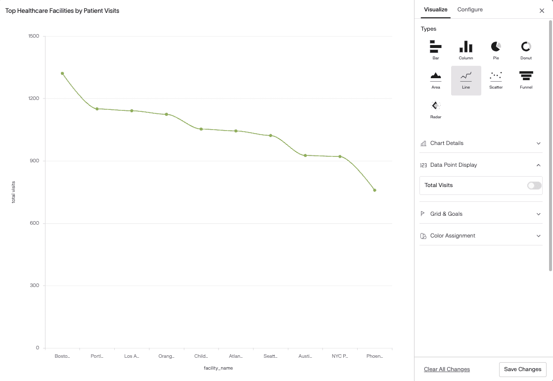
A line graph displays data points connected by straight lines to show changes over a period of time. It is mainly used to track trends, patterns, and fluctuations in continuous data.
Line graphs are ideal for analyzing growth, decline, and seasonal variations. They help users understand how values move from one point to another, making long-term patterns easy to identify.
Line graphs are commonly used to:
Track sales, revenue, or website traffic over time
Monitor stock prices and market trends
Analyze temperature, weather, or climate data
Measure performance progress
Example:
A business can use a line graph to show monthly website traffic from January to December.
Bar and Column Charts (Comparisons)
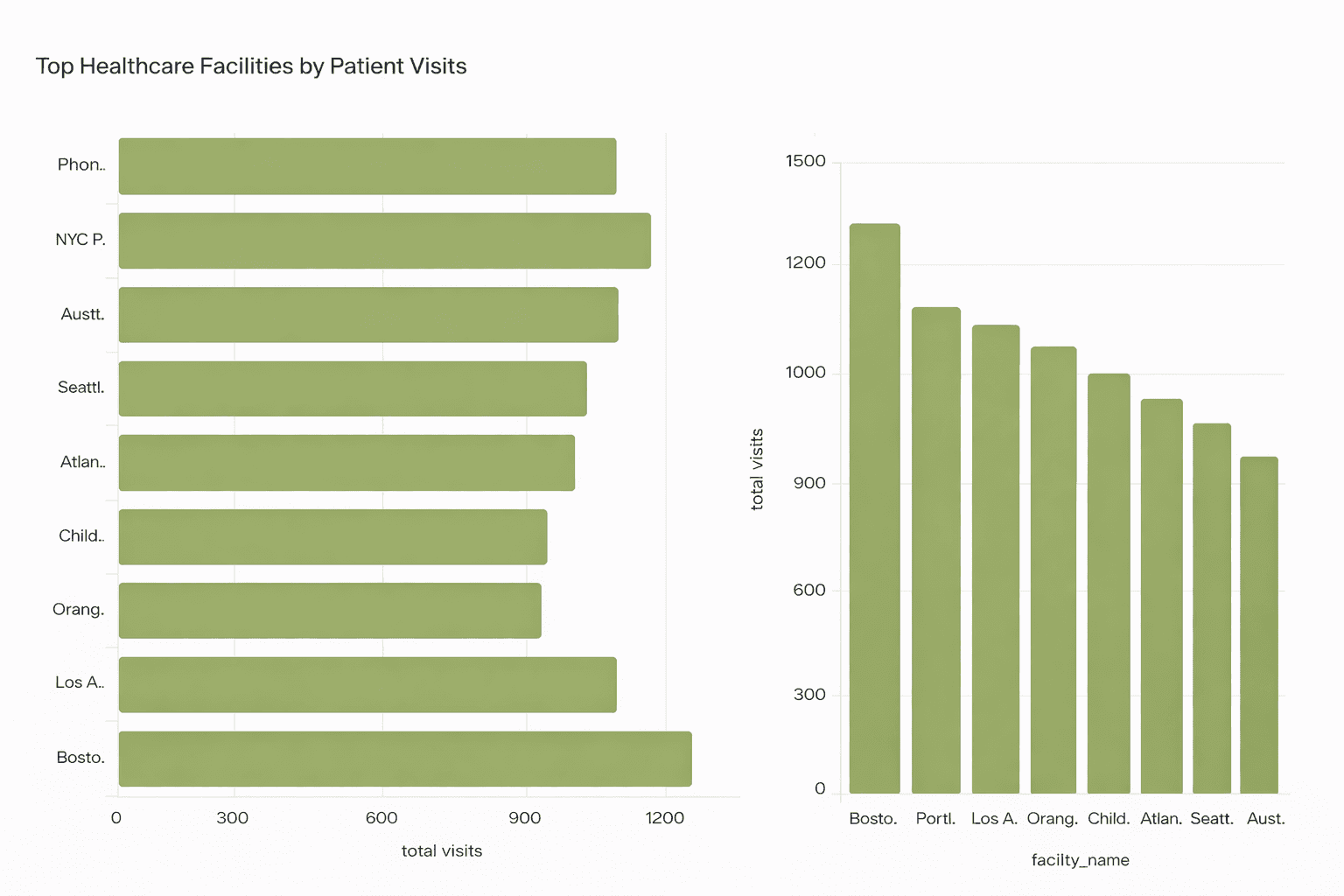
Bar and column charts display data using rectangular bars to compare values across different categories. The length or height of each bar represents the size of the value.
These charts are best for showing differences between groups and ranking items clearly.
Bar and column charts are commonly used to:
Compare sales across products or regions
Show exam scores of students
Analyze department performance
Display survey results
Example:
A company can use a bar chart to compare quarterly revenue from different departments.
Pie and Donut Charts (Proportions)
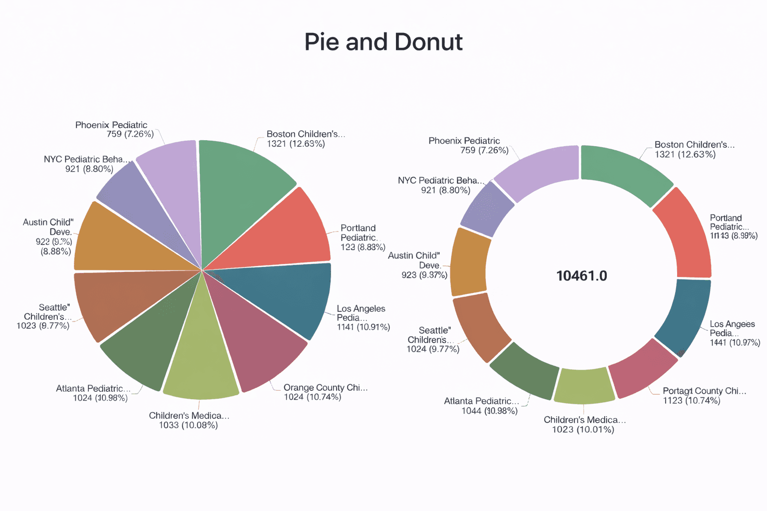
Image source Supaboard Dashboard
Pie and donut charts show how individual parts contribute to a whole. Each slice represents a percentage of the total value.
If you want to quickly create visual representations without manual design work, an online pie chart maker can help you generate accurate charts in just a few clicks.
They are most effective when comparing a small number of categories.
Pie and donut charts are commonly used to:
Show market share
Display budget allocation
Analyze traffic sources
Present survey percentages
Example:
A marketing team can use a pie chart to show traffic sources.
Area Charts (Growth Patterns)
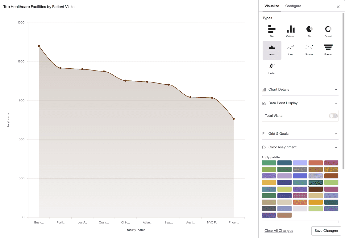
An area chart is similar to a line graph but fills the space below the line to emphasize volume and total growth.
It highlights overall trends and cumulative values over time.
Area charts are commonly used to:
Track total website visitors
Monitor revenue growth
Compare multiple trends
Show cumulative data
Example:
A business can use an area chart to compare total monthly revenue across products.
Scatter and Bubble Plots (Relationships)
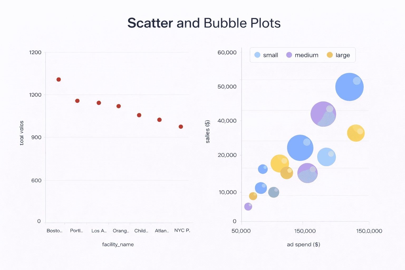
Scatter plots show data points on two axes to display the relationship between two variables.
Bubble plots add a third variable using bubble size.
Scatter and bubble plots are commonly used to:
Identify correlations
Detect outliers
Analyze relationships
Compare multiple variables
Example:
A company can analyze advertising spend and sales using a scatter plot.
Advanced Graph Types for Deeper Data Analysis
Advanced graph types help analysts explore complex datasets, uncover hidden patterns, and gain deeper insights. These visualizations are especially useful for professional reporting, performance evaluation, and strategic decision-making, where detailed analysis and accuracy are essential.
Histograms (Data Distribution)
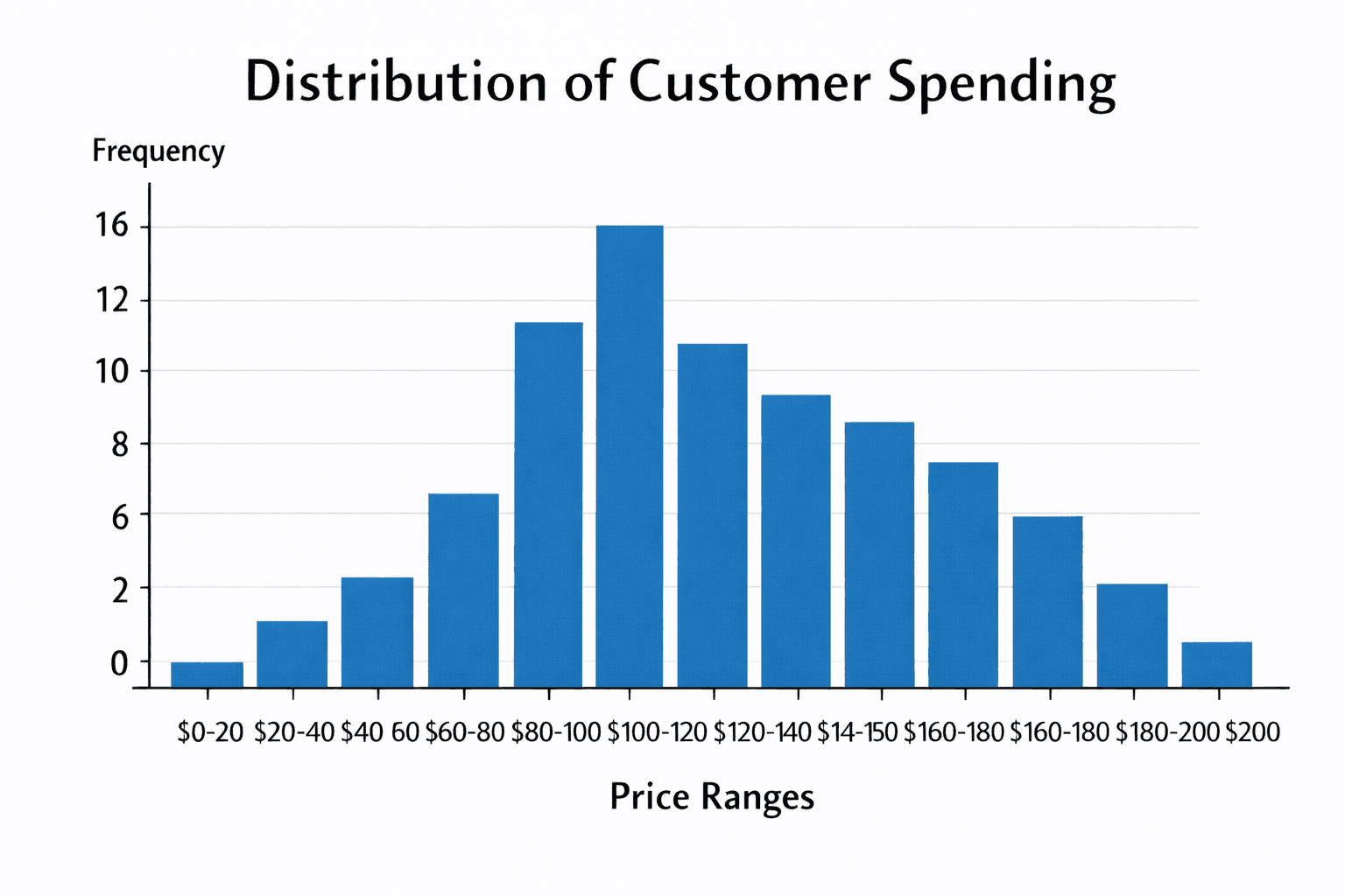
A histogram displays the distribution of numerical data by grouping values into ranges called bins. It shows how frequently data points fall within each range. Analysts use histograms to understand data spread, identify skewness, and detect unusual patterns. For example, it helps examine customer spending behavior across different price ranges.
Heatmaps (Pattern Detection)
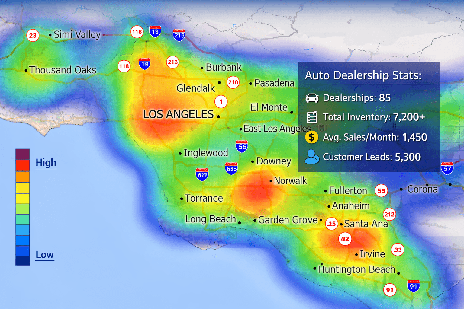
A heatmap uses colors to represent data values within a table or matrix. Different shades indicate intensity, frequency, or performance levels. Heatmaps are useful for identifying patterns, trends, and problem areas quickly. For example, businesses use heatmaps to analyze website clicks and user activity across different pages.
Box Plots (Outliers and Variance)
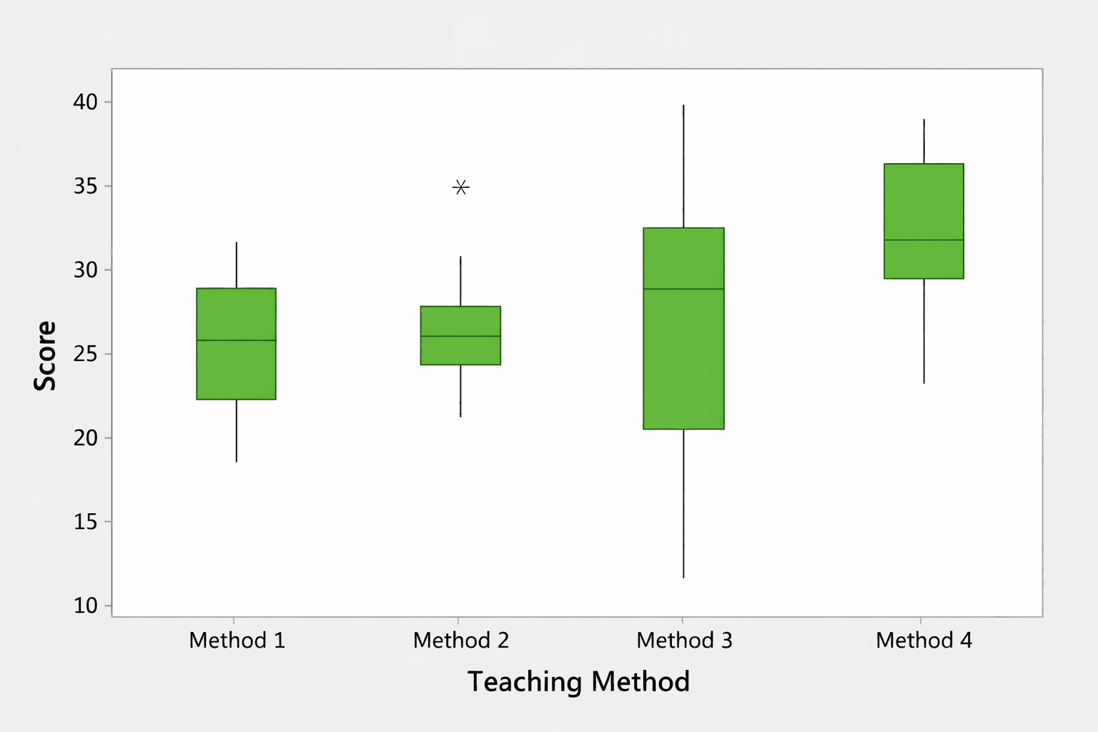
A box plot summarizes data distribution using quartiles, medians, and ranges. It highlights data spread and identifies outliers clearly. Analysts use box plots to compare variations across groups and detect abnormal values. For example, it helps evaluate salary differences across departments and spot unusually high or low figures.
Treemaps (Hierarchical Data)
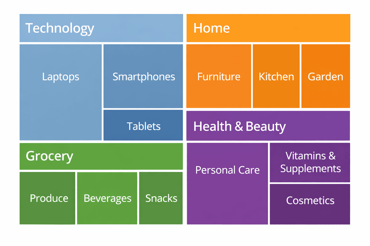
A treemap displays hierarchical data using nested rectangles, where size and color represent values. It helps visualize proportions within categories and subcategories. Treemaps are useful for analyzing large datasets with multiple levels. For example, companies use treemaps to view sales distribution across regions and product lines.
Radar Charts (Performance Analysis)
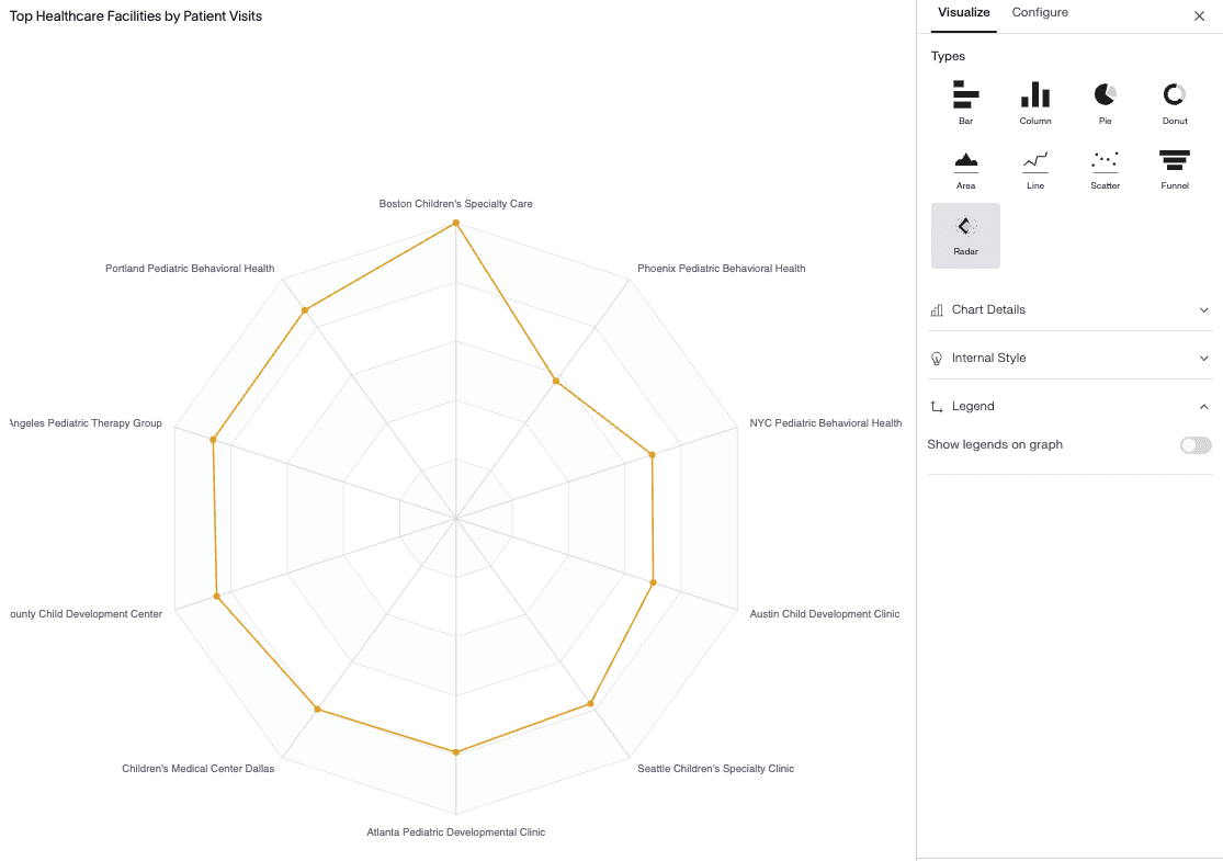
A radar chart displays multiple variables on a circular grid, allowing comparison across different performance factors. Each axis represents a metric, and data points form a connected shape. Analysts use radar charts to evaluate strengths and weaknesses. For example, they help compare employee skills or product features across criteria.
To understand the difference between comparison and distribution charts, read our detailed guide on bar graph vs histogram.
Graph Types Used in Statistics, Research, and Surveys
Graphs play a vital role in statistics, research, and survey analysis by transforming complex datasets into meaningful visuals. They help researchers identify patterns, test hypotheses, and communicate findings clearly. Whether analyzing experimental results, population data, or business surveys, choosing the right graph improves accuracy and understanding.
Frequency and Probability Graphs
Frequency and probability graphs show how often values occur within a dataset and how likely certain outcomes are. Common examples include histograms, frequency polygons, and probability curves. These graphs help researchers understand data distribution, detect trends, and measure variability. For example, they are widely used in exam result analysis and quality control studies.
Regression and Trend Analysis Charts
Regression and trend analysis charts are used to examine relationships between variables and predict future behavior. Line graphs, scatter plots, and regression lines help identify correlations and long-term patterns. For instance, economists use these charts to study the impact of interest rates on consumer spending.
Sampling and Demographic Visuals
Sampling and demographic visuals present data related to age, gender, income, education, and location. Bar charts, pie charts, and stacked graphs are commonly used for this purpose. They help researchers compare groups and understand population characteristics in surveys and social studies.
Academic vs Business Reporting
In academic research, graphs focus on accuracy, detailed labeling, and statistical validity. In business reporting, visuals emphasize clarity, simplicity, and quick insights. Both aim to communicate data effectively but are designed for different audiences and decision-making needs.
Graphs vs Tables: How Professionals Present Data
Situation | When Graphs Work Better | When Tables Are More Accurate | How to Combine Both for Clear Reporting |
|---|---|---|---|
Trend Analysis | Line and area charts clearly show growth, decline, and seasonal patterns over time. | Tables provide exact numerical values for each time period. | Use a line graph for trends and place a data table below for detailed figures. |
Performance Comparison | Bar and column charts quickly highlight differences between categories or teams. | Tables allow precise comparison of multiple metrics at once. | Show a bar chart for visual comparison and link it to a performance table. |
Financial Reporting | Charts summarize revenue, profit, and expenses for quick review. | Tables display complete financial statements with exact amounts. | Use charts in dashboards and detailed tables in downloadable reports. |
Survey Results | Pie and bar charts make response patterns easy to understand. | Tables show individual responses and percentages clearly. | Add charts for presentations and tables for deeper analysis. |
BI Dashboards | Interactive graphs help users explore data visually. | Tables support filtering and exporting raw data. | Combine dynamic charts with drill-down tables for better decision-making. |
Common Graph Mistakes to Avoid
Even well-designed graphs can become misleading if they are not created correctly. Avoiding common visualization mistakes helps ensure your data remains clear, accurate, and trustworthy.
Using Too Many Colors
Using excessive colors can confuse readers and distract from key insights. Stick to simple and consistent color schemes.
Truncated Y-Axis
Starting the Y-axis above zero can exaggerate differences and mislead viewers. Always use proper scaling unless clearly justified.
Overcrowded Labels
Too many labels, data points, or categories make graphs hard to read. Keep visuals clean and focused.
Using 3D Charts
3D charts distort perspective and make values difficult to interpret. Flat 2D charts are more accurate and professional.
Choosing the Wrong Chart Type
Using an incorrect chart type, such as a pie chart for many categories, reduces clarity. Always match the graph to your data goal.
What Are the Benefits of Using AI-Powered Tools to Create Graphs and Charts Instead of Traditional Methods?
AI-powered tools like Supaboard simplify the process of creating graphs and charts by automatically analyzing data and selecting the most suitable visual formats. Unlike traditional methods that require manual calculations and formatting, these tools reduce human error and save valuable time. They also offer multiple options for customizing data visualizations, allowing users to adjust colors, layouts, labels, and formats according to their needs.
In addition, AI-based platforms provide real-time updates, interactive dashboards, and intelligent insights for better decision-making. With Supaboard, teams can easily create, customize, and share graphs and charts while monitoring performance instantly. This improves productivity, enhances reporting quality, and supports smarter business intelligence workflows.
Many organizations now rely on AI-powered business intelligence tools for faster and more accurate reporting.
Frequently Asked Questions (FAQs) About Graphs and Charts
How Many Types of Graphs Are There?
There are various sorts of graphs : line graphs , bar charts , pie charts , scatter plots , histograms , area charts , and more . Each category has a specific purpose for example to demonstrate trends, comparisons or relationships. The best solution relies on your data and analytic goals.
Which Graph Is Best for Comparison?
Bar charts and column charts are the best for comparison. They clearly show differences between categories, products, or time periods. These graphs make it easy to identify high and low values at a glance, which helps in performance analysis and reporting.
What Is the Best Chart for Showing Trends Over Time?
Line graphs and area charts are ideal for showing trends over time. They help track growth, decline, and seasonal changes. These charts are commonly used in business reports, sales analysis, and financial forecasting.
Are Charts and Graphs the Same Thing?
Charts and graphs are similar but not exactly the same. Graphs usually focus on showing relationships using axes and scales, while charts are broader visual tools used for presenting data. In practice, both terms are often used interchangeably.
How Do I Choose the Best Type of Graph for My Data?
To choose the best graph, first understand your data type and goal. Use line graphs for trends, bar charts for comparisons, pie charts for proportions, and scatter plots for relationships. Always select a graph that makes your data clear and easy to interpret.
Conclusion
Graphs are not just for decoration, but are crucial tools to evaluate data and to make smarter decisions. Used properly they point out trends, make patterns visible and help to make difficult subject easier to absorb.
Getting to know the numerous sorts of graphs and when to use them will make your reports, presentations and analyses more clear and impactful. Learning data visualization may help you turn raw statistics into meaningful insights that enable smarter and more confident decision-making whether you work in education, research or business intelligence.